Wednesday, 9 January 2013

Dark Matter: Pavel Tchelitchew's 'Tattooed Man'


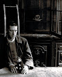
Variously referred to as 'Man with Tattoos' or 'Portrait of a Tattooed Man', Pavel Tchelitchew's iconic portrait was painted in Paris in 1934, and was, up until the time it was sold at Sotheby's, New York in 2010, in the collection of the actress Ruth Ford. Her brother, the writer and publisher Charles Henri Ford was Tchelitchew's life-long partner, who died in 2002, Ford herself dying in 2009 at the age of 98. Her apartment in New York's Dakota building was crammed with masterworks by Tchelitchew, amongst other 20th-century masters, and this astonishingly powerful portrait of a man, darkly-attired in an acrobat's leotard, was estimated to sell at auction for between $250,000.00 and $350, 000.00.

Tchelitchew was born in Russia in 1898, and fled after the 1918 Revolution, eventually to Paris, where he settled in the artistic quarter of Montparnasse and was soon feted by the artistic and literary haute-monde of the day, notably by Gertrude Stein and her lover Alice B. Toklas and later by Edith Sitwell (who was largely responsible for introducing the painter and his work to British collectors).  His work would later evolve into a Neo-Romantic style, with an overwhelming sense of the metamorphic, where stellar and planetary aspects became an essential component to portraits already imbued with mystical and dream-like cadence. It is the economy, however, of Tchelitchew's portrait of the unknown sitter that attests to his skill as an interpreter of the male form in both power and stillness. Hewn from the dark background, the subject is clothed in the one-piece costume rendered by the painter even darker than the surroundings that he emerges from; an Ariel-like figure anchored to the earth by the encroaching blackness that engulfs him. In repose, the face is passive; the averted gaze belies little emotion yet, framed by his raven-black forelock, he is rendered equally as a figure or vulnerability and as an object of the sitter's- and, by extension - our desire. In starkest counterpoint to the darkness around him is the blueness of his tattoos against the warmth of golden skin that truly make this perhaps his finest work of the period. There is a subcutaneous glow to the flesh, a blurring to the edges of the ink beneath the epidermis that single out this astonishing painting as one of his greatest. The gesture of strong arms crossing to shield a stronger yet somehow vunerable body serves to better define the dense tracery of the designs that decorate him, truly fixing our gaze, and rendering him an illuminated angel against the impenetrable darkness at his back. 

Ruth and Charles Henri Ford were devoted siblings who, by virtue of their family wealth, were able to indulge their joint passions for the arts and patronage to an unpresidented  degree. Their separate apartments in the iconic Upper West Side Dakota building were the settings for some of the most famous literary and artistic gatherings of the era. Charles was the author of The Young and Evil, written in 1933 and regarded as the first novel in the U.S. to explore themes of homosexuality and 'genderqueerness'- a term coined much later in the century to describe a group or an individual who exists outside of 'normal' modes of sexual and social mores. Gertrude Stein opined that Ford's novel 'beat the Beat Generation by a generation' and focuses on the lives of a group of artists as they write poetry, have sex and generally lead the lives of artistic outsider-itinerants, moving in and out of New York's cheap apartments and rented rooms. It's candor was astonishing for the period, and rocked the established literary world to the core. Rejected by almost every major American and British  publisher, it was picked up by Obelisk Press in Paris and became an early counter-cultural phenomenon which anticipated and pre-figured the novels of William Burroughs and Hubert Selby by two decades. Ford's circle inevitably included the leading gay lights of his generation: photographers Hoyningen-Huene and George Platt-Lynes most notably, as well as luminaries such as Cecil Beaton, Leonor Fini, Carl Van Vechten, Orson Welles and George Balanchine. Ford was photographed by Beaton for Vogue in 1937, wearing a costume designed by Salvador Dali. Ford bought Tchelitchew to New York in 1934, having begun a relationship that lasted their lifetimes. Ford was also the instigator and publisher of View, a magazine that was seen as the pivotal Surrealist publication of the pre-and post-war period in Europe and the U.S.

The majority of the works in Ruth Ford's collection were gifted to the actress during the painter's lifetime, with many more bequeathed to her on her brother's death. It is highly likely that Tchelitchew's masterly portrait of the Tattooed Man came to her latterly, and was thought to be amongst the most significant of his works in her possession. It epitomizes the painter's work of the period, made all the more fantastical by the enigmatic nature of the subject whose decorated forearms hint at some sort of inner psyche which we, the onlooker can only attempt to guess. Lincoln Kirstein, the painter's biographer and contemporary stated that 'Tchelitchew became absorbed with the idea of metamorphosis, a collective object or image composed of other complete images- and their interplay, balance, contrast and opposition in which there was a ceaseless dialogue of the whole with its parts'.


The Bicycle Thieves


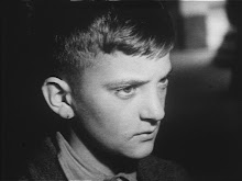
Universally hailed as one of the greatest films ever made, Vittorio De Sica's 1948 Academy award-winning masterpiece, 'The Bicycle Thieves' ('Ladri di biciclette') defined an era in cinema. In postwar, poverty-stricken Rome, a man, hoping to support his desperate family with a new job, loses his bicycle, his main means of transportation for work. With his wide-eyed young son in tow, he sets off to track down the thief. Simple in construction and dazzlingly rich in human insight, 'Bicycle Thieves' embodied all the greatest strengths of the neo-realist film movement in Italy: emotional clarity, social righteousness, and brutal honesty.

Tuesday, 17 January 2012

Claire de Rouen


Claire de Rouen, the doyenne of fashion and photography books, has died after a long illness. I first met Claire in the late seventies at the Photographer's Gallery, where she was an eternal presence behind the counter that served as the diminutive bookshop in their Newport Street premises. To this day, I regret the non-purchase of a Minor White monograph which Claire predicted 'would become extremely sought after in years to come, darling'.

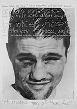
During the eighties and for most of the nineties, she was the force behind the photography and fashion department at the original Zwemmer bookshop in Charing Cross Road. Her breathtaking knowledge of the subjects made her the icon of fashion students and famous photographers alike. I had the pleasure of working with her during her short-lived tenure with Shipley Art Booksellers. It is however, for the shop that proceeded this period that she will best be remembered. She was afforded the governance of a small premises on the first floor of a sex shop at the Tottenham Court Road end of Charing Cross Road, and it soon became a mecca for the faithful as well as the neophite to the world of photography and fashion. The shop was easy to miss, but a discreet neon sign in the window directed the determined to their destination like a beacon. It flourished as much by word of mouth as any website, and garnered a reputation among a dedicated cognoscenti for whom Claire's advice was paramount. With her trademark bob and a fringe that skimmed those smokey, intriguing eyes, Claire's dress-sense was immaculate; her look was timeless and never disappointed. Usually sat by the till, her faithful pug Otis curled beneath the desk, she would direct customers to whatever newly-published book she thought might suit their needs and tastes, but often, she simply delighted at your own discoveries amidst the stock. Seldom resorting to the shop's database, she knew her books by heart, with rarities temptingly encased in a vitrine which were never priced but which she would be more than happy to let you examine. Collectors were legion, and giants of the photography world sought her out when they were in town. Bruce Weber was a regular visitor, and Claire was an early advocate and seller of his monographs. David Bailey was a huge fan, stating that Claire's was 'probably the best photography bookshop in the world' and it was Bob Carlos Clark who persuaded her to open premises under her own name.

Born Claire Alphandri in Alexandria in the early thirties, her age was always a notoriously-guarded secret. She attended art school in London and married Reid de Rouen in the 1950s. She met John Nichol in the mid 1980's, and they lived and worked together until her death this week. Claire was passionate about the things she loved, and kept her manicured finger firmly on the fashion pulse of her time. Her mystery and allure added greatly to the shop's atmosphere. She was a tireless champion of young photographers and fashion students (the newly-graduated Alexander McQueen adored her) and she often displayed their work in the stairwell gallery adjacent to the shop. Her stock of fashion and photography magazines from around the world was unrivalled.

Claire de Rouen books will continue without her, but her legacy will live on there for as long as it remains open, as I trust it will for many years to come. The world will be poorer without her, and her throne within the pantheon of fashion and photography will remain unoccupied. It was a privilege to have known her.

Thursday, 12 January 2012

The Lion Roars in Rye


William Morris's epithet of having nothing in your houses that you do not know to be useful or believe to be beautiful has never seemed more apposite than in the case of The Lion Street Store in Rye, East Sussex. Owned and operated by former milliner Sarah Benton, the shop has been open only a few short months, but it has clearly already attracted a huge following which spreads far beyond the ancient Cinque Port town. Situated just down from the historic St Mary's church which crowns the Rye skyline, Sarah has created a light and airy space and stocked it with objects of desire which are a feast for the eyes and the senses. The best in contemporary-designed items effortlessly blend with carefully-chosen vintage pieces, all of them bought together with an assured sensibility which makes the shop such a mecca for all who hanker for the unique and the unusual in their home. With all the panache of a Bawden vignette for Fortnum and Mason, Nicholas Frith's masterful logo of the sailors and the friendly lion perfectly captures the mood of the shop, as elsewhere, fabric dolls by Jane Foster and textiles by Lisa Stickley sit alongside one-off toy theatres by Emily Warren. Knitted creatures by Donna Wilson become the outriders in a vintage Triang truck, whilst distressed children's desks open to reveal their treasures. Sarah shares with her customers a passion for the miraculous images of the likes of Robert Taverner and Edwin La Dell, and the card racks overspill with the cream of British 20th-century printmakers. Wire baskets are packed with handwoven Irish blankets, fashioned from recycled wool, whilst elsewhere are screen-printed boy and girl-shaped cushions that somehow evoke the days of 'Look and Learn' and the Ladybird series of books so beloved of our childhoods. In the coming months, Sarah hopes that the store will become a regular venue for literary and musical events, and is keen to organise one-off specialist exhibitions of artists and craftspeople. With a contemporary eye fixed firmly on the sensibilities of similar institutions such as St Jude's Gallery, Loop in Islington and Old Town in Holt, Sarah's conviction that people deserve to have the very best in British art and craft is everywhere evinced at the Lion Street Store. The ancient town of Rye has never seemed so fortunate to have this newcomer in her midst; I urge you to beat a path to its' lovely painted portal.

The Lion Street Store. 6 Lion Street, Rye, East Sussex TN31 7LB
www.lionstreetstore.com

Tuesday, 15 November 2011

Drella does Rainer: Warhol's poster for Fassbinder's 'Querelle'


Andy Warhol's poster for Rainer Werner Fassbinder's 1982 film adaptation of Genet's 'Querelle of Brest' uses an original photograph culled from a 1977 series of screenprints entitled Sex Parts, and remains one of his most potent and memorable images. Now highly desirable by collectors, the original poster was issued in a number of colours (pictured is the grey version), and despite Warhol's interpretation bearing no direct reference to the film itself, somehow retrospectively at least, succeeds in being thoroughly synonymous with Fassbinder's vision of Genet's 1946 novel. The film was Fassbinder's last, and European distributors in particular, released a plethora of promotional material, from giant 7-sheet billboard images to artfully-airbrushed portraits of Brad Davies, who played Genet's eponymous murdering sailor-hero. Warhol's photographic image of two boys is overdrawn in his customary style with off-register lines and blocks of colour, and possibly recalls the characters of Querelle's brother Robert, and Gil, his fellow matelot and murderer. Frank Episale, in his riveting review 'Genet meets Fassbinder' in Bright Lights Film Journal, states that 'Genet's Querelle bought Melville's Billy Budd out of the closet and exposed the coded homoeroticism of the all-male naval vessel inhabited by men and boys in tight white pants to a wider, largely heterosexual audience'. Fassbinder's film pays visual homage to James Bidgood's 1971 American underground arthouse classic Pink Narcissus, in which a handsome male hustler fantasizes about a kitsch universe where he is the central character in a number of set-piece encounters. By extension, the gay French photographic duo Pierre and Gilles owe a debt to Bidgood's fantasy-world by placing their protagonists in a number of highly-wrought and glitteringly-enchanted settings where there is more than a nod to Genet's muscular matelots in all their campy eroticism. Fassbinder's set for Querelle is highly stylized and uses overly-wrought lighting techniques reminiscent of those which he employed in Lola a year earlier. Frames are shot within frames, and the misty murk of Brest is re-imagined with phallic towers and dark culverts where lurk and lean the denizens of Genet's twilight world. Episale concludes his review by reminding us that by the time the film was released, 'Susan Sontag had already published Notes on Camp, Stonewall had come and gone', and that '[The Village People's] YMCA had been appropriated by wedding DJ's'.

Tuesday, 25 October 2011

Pryde of Place: The Beggarstaff Brothers and 'Don Quixote'


Arguably the finest of all the poster designs created by William Nicholson and James Pryde, working under the aegis of the Beggarstaff Brothers, was for a play entitled A Chapter from Don Quixote which opened at the Lyceum Theatre on 4th May 1895 with Sir Henry Irving in the title role. The production, based on an incident in Cervante's novella, consisted of two scenes contrived out of an adaption by W.G.Wills, but as it was not deemed sufficient for a night's entertainment, it formed part of a triple-bill. Convinced that Cervantes was worthy of more serious treatment than that conceived by Irving for the play (in attempt to divert the audience's attention from the poverty in Cervantes' text, Irving included extravagantly comic antics and slapstick elements in the narrative), the Beggarstaffs introduced the dramatic graphic device of the windmill in place of the village pump, around which the main action of the play took place in the second scene. Their authentic depiction of Rosinante, Quixote's horse, replaced a more robust creature (a veteran of the London stage) that Irving attempted to make more pathetic by the use of make-up to replicate the fictional creature's emaciated look. The Beggarstaffs made three separate versions of the Don Quixote poster. The first, dating from 1895, was a collage that lay for many years in Nicholson's studio before being acquired by the Victoria and Albert Museum. The second version was then superceded by one that was later published in the 1896 edition of The Idler, and the third- a simplified version of the first two- was presented to Irving, whom, it was said, thought it too bold a design for use on London theatre hoardings. Pryde later claimed in his autobiography that not only did Irving commission him and Nicholson to design the poster, he paid them a hundred pounds for the result.

The Beggarstaff design for Don Quixote poster remains one of the most iconic images in British graphic history. Colin Campbell, the leading authority on the graphic work of Nicholson and the Beggarstaff Brothers, refers to the poster as the earliest large-scale work in which 'the lettering was conceived as part of the composition from the very beginning'. The poster design also shows the full impact on Pryde and Nicholson of Toulouse-Lautrec, for whom their admiration was boundless at the time. Pryde was quoted in The Idler as saying that Lautrec was 'one of the few artists who understand what a poster is and should be'. The French artist's design for La Goulue at the Moulin Rouge of 1891 was of particular significance to Pryde and Nicholson, and showed how flat, ungradated masses of colour could artfully be combined with line, and how light and dark forms could be contrasted as a key component of the overall design. Lautrec had also demonstrated the decorative potential of a simple black mass as a means of enhancing the pictorial interest in the work, and in turn, the Beggarstaff poster for Don Quixote displays this to stunning effect, particularly in the contrasting form of the horse's head juxtaposed against the dark hulk of the windmill, and the way in which the liminality of the sails are cut off by the extremities of the design.
Monday, 10 January 2011

I Was a Boy Dalek


The Dalek Playsuit is an enduring memory and, given the plethora of Dr. Who-related merchandise that has resulted from the programme's phenomenal rebranding and re-invention, it seems that this particular item of early Dalek merchandise is one that tends to remain in the minds of those of us who are of a certain vintage, and for whom Saturday evenings were spent cowering behind the couch with delight and terror in equal measure. I was particularly struck to see this advertisement from an old Marshall Ward mail order catalogue, as doubtless, it was the very same one that caught my childhood eye and possessed my every waking hour all those many years ago, so much so that my beleaguered mother was driven to distraction by my constant badgering until it was sent away for (and at the outrageous cost of 66/6. it must have been intended to be a gift for several birthdays and Christmases combined). Let's face it, in the light perhaps of today's more finely-tuned aesthetic sensibilities, the Dalek Playsuit was, by anyone's standards, a superannuated bin bag, through which a sink plunger was thrust through one hole, a plastic potato-peeler through the other. It came down to just below the knees (despite the floor-length apparition we see in this somewhat overstated illustration) and lent the wearer the appearance of being clad in a futuristic mini-dress such as Courreges might have dreamt up for the catwalk. The head-piece was fashioned from stout cardboard, silvered on the outside, and with a series of die-cut slits through which one just about saw the direction of travel; the 'skirt' hung down from its base, whilst that dome was a sort of inverted saucer that sat on your head like a coolie-hat. The eye-piece was fixed, and was basically a large ping-pong ball on a stick. The colour of the skirt was red, and the trademark 'balls' on the Dalek's skirt were printed in white. I more or less lived in it (again, much to the frustration of my poor mother, who later decreed its fate) and when I decided to leave home, aged probably about eight or nine, it was my going-away outfit. I would like to imagine that to this day, there might be some soul who retains a glimmer of recollection that, whilst driving in Sussex in the sixties, they glimpsed the apparition of a Dalek wandering down the central reservation of the A22 like a revenant from a dream. Miraculously, I got as far as the pig-farm (the marmalade sandwiches having by then run out by then, thus posing something of a dilemma as regards supplies for any ongoing journey), whereupon I was duly returned on the back of the farmer's tractor (again, this must have been something of a sight to an unwitting onlooker). The days were numbered for the Dalek playsuit: my mother, at her wit's end, finally consigned it to the flames of our kitchen Raeburn on the very night of the Royal Variety Performance when the Beatles were blazing their own trail before the Queen of England. This act of iconoclasm on her part proved a step too far, as it set fire to the chimney at the exact moment the Fab Four took to the stage. A postscript. I am reliably informed that any Dalek playsuit that has survived (either flood or fire) commands huge prices on the vintage market; six to eight hundred of anyone's money, and that no one I know has ever seen one offered for sale, nor as a collector, possessed one in adulthood.